
Balancing product innovation
with emotional resonance.
From concept to launch, we’re committed to your success with rapid response times and personalized attention to detail.



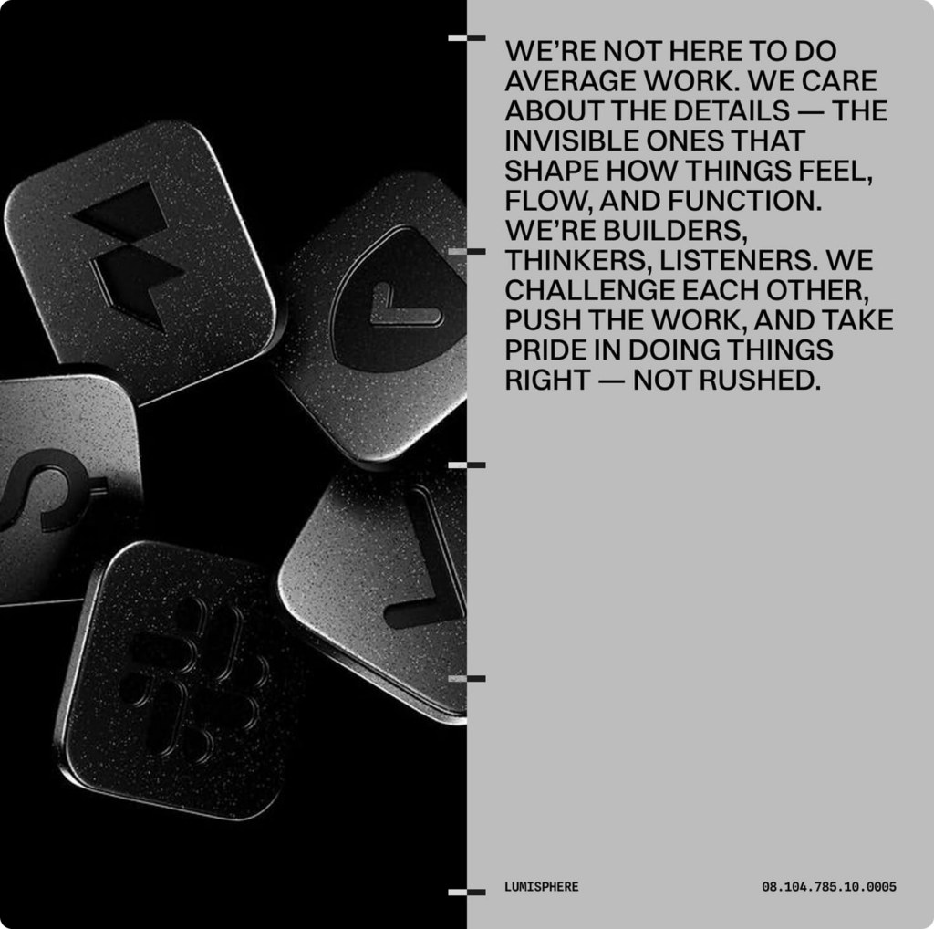
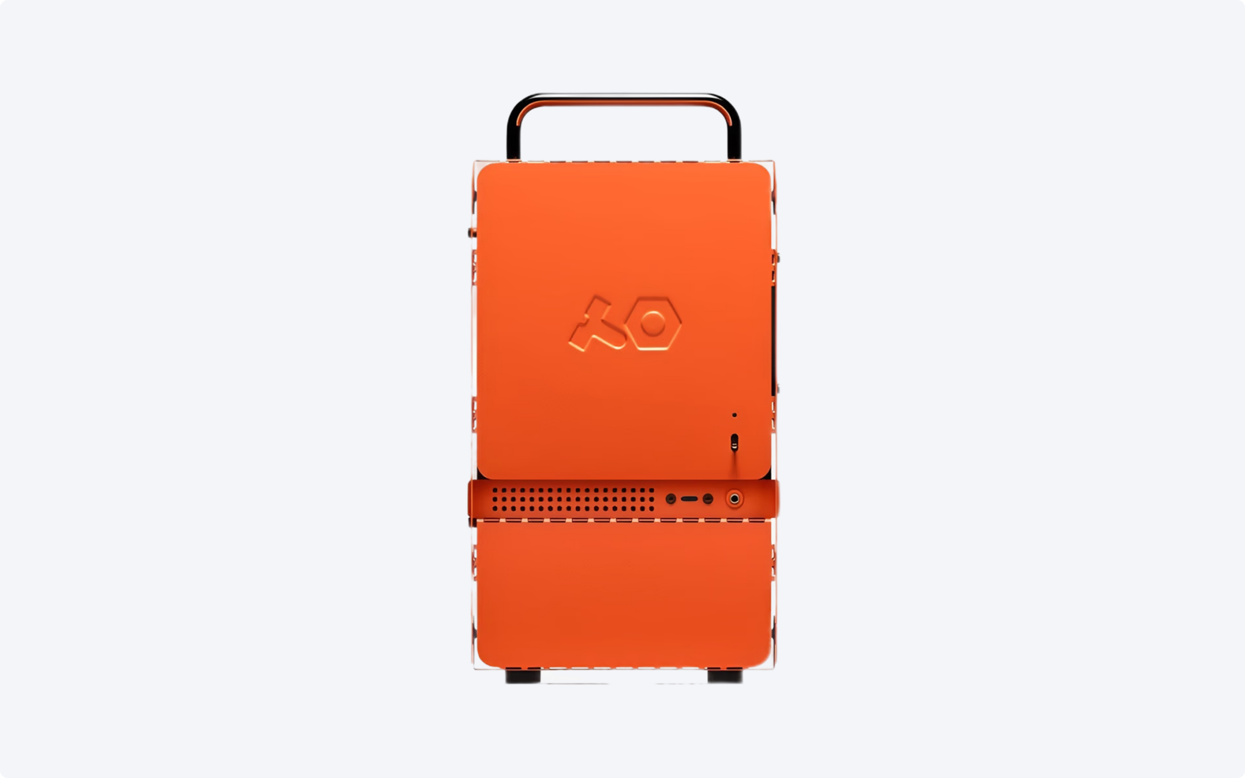
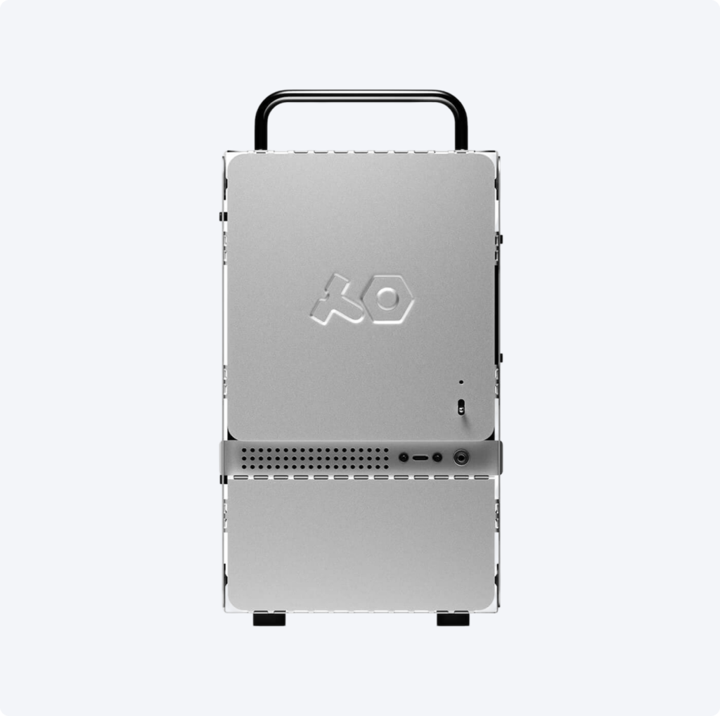
We created a simple, considered visual universe where every element is rooted in the product’s core characteristics. The symbol is directly from the product itself, while the wordmark reflects its round, simple forms.
The color palette is built around the product’s strong yellow, giving the identity warmth and clarity. A clean typographic system allows the brand’s playfulness to come through in tone of voice, rhythm, and layout.